
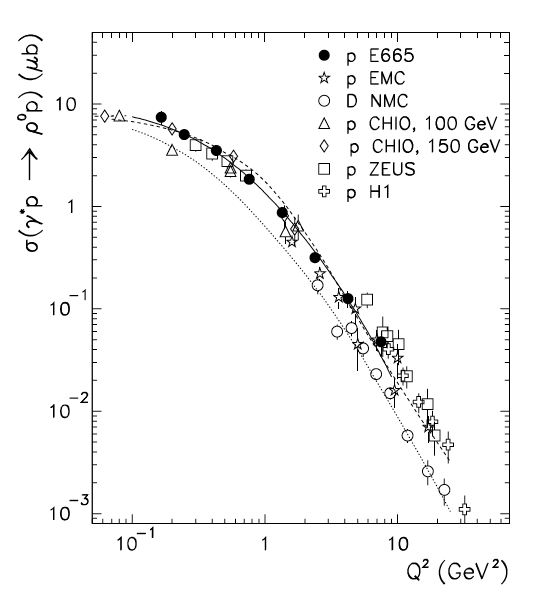
So you want to publish or show your data in a talk or paper. Here is some basic advice.
- Label your axes.
- Make certain you have units on your variables.
- Make your labels and symbols large enough that someone can read them. On a slide 16 pt type should be a minimum. In text generally 10-12 pt.
- Read the journal’s formatting guidelines.
- Make your lines thick enough to print well. This plot is marginal on line thickness.
- Add a caption that explains what the components of the plot are.
- Make certain your data, in this case, E665, is explicitly labeled in the plot.
- Example is from Adams, et al., Z.Phys.C 74 (1997), 237-261.
Evil genius tips:
- Your data are big solid circles plotted on top of the rest. Their data are open possibly smaller symbols underneath.
- A log scale can cover a multitude of sins. For example, those curves differ by a factor of 2 in absolute normalization.
More socially constructive tips:
Consider how your plots may appear to others.
- Some people print your plots in B+W – are they readable? One solution is to use solid, dashed and dotted lines as in the example plot. One can also use different hatching patterns instead of solid colors. Almost all plots until around 1990 were done this way.
- Are your fonts big enough? People at the back of the room, and the superannuated geezer (me) that might be on your next funding review may not be able to read small type.
- A not-insignificant number of people have some form of color-blindness. Check out the many websites on this topic, especially https://colorbrewer2.org/, to find color palettes that make your plots more accessible.
Next the formal rules:
Physical Review Guidelines for Authors
has some useful hints on all aspects of publication.
with specific PRL Figures rules on sizes for labels and axes.
